28 Optical Character Recognition
When OCR (Optical Character Recognition) comes up, most people think of scanners and document digitization: thousands of character classes, endlessly varied fonts and layouts. Industrial OCR is an entirely different business. What the production line has to read is the production date an inkjet printer sprays onto a bottle cap, the serial number a laser engraves into a metal part, the lot number a dot-peen marker punches into a nameplate — the character set is often just a few dozen symbols (digits plus a handful of capital letters), and the font is dictated by the marking equipment and completely fixed, but the imaging conditions are far harsher than a scanned document: curved reflective surfaces, ink of uneven density, strokes broken by clogged nozzles. Under this combination of “small character set, fixed font, hostile surface,” the classical trainable font approach remains the workhorse to this day: train a small classifier on real characters collected on site, and its robustness to this particular font far exceeds any general-purpose document OCR. In this chapter we walk this route end to end with a custom dot-matrix font — training, recognition, stress testing, until we push it to failure with our own hands. Figure 28.1 is our “font”: 16 characters, 0–9 and A–F, each 20×28 pixels, ink gray level 50 on a background of 200, deliberately including confusable pairs such as 0/D and 8/B.

28.1 The Classical OCR Pipeline
Classical OCR decomposes “reading characters” into four steps, each built on the foundations of earlier chapters.
- Binarization: separate the character strokes from the background to obtain the foreground region. This is the thresholding of Chapter 7 — character-to-background contrast is usually high, so a fixed or automatic threshold is up to the job; the key is choosing the right polarity (dark characters or bright ones).
- Character segmentation: cut the foreground region into individual character units. Its core is the connected-component analysis of Chapter 23, overlaid with the structural priors of text: characters line up in rows, spacing within a row is roughly uniform, and character width, height, and area fall within known ranges.
- Feature extraction / normalization: rescale each character crop to a uniform size and extract gray-level or shape features.
- Classification: map the features to a character label with a classifier — exactly the subject of Chapter 29, except that the classes change from “good/defective” to 16 characters.
Deep-learning OCR (the SDK has a separate DLOCR module) performs detection and recognition end to end, well suited to scenes with variable fonts and complex backgrounds; but for inkjet-code reading with a fixed font and a small character set, the classical route needs few training samples, runs fast, and fails in explainable ways — it remains the lighter and more controllable choice. This chapter does not cover DLOCR.
Note one structural fact: these four steps form a one-way pipeline, where each step’s output is the next step’s input unit. However clever the classifier, it can only answer for the patch of image that segmentation hands it — this seemingly trivial observation will reveal its full weight in Section 28.5.
28.2 Training the Font
SciVision’s classical OCR workflow is a three-act play: segment — label — train. We first render one clean training row of the 16 characters (Figure 28.1), binarize it with GetCharRegion to obtain the character foreground region, then use SegCharacters to cut out 16 character crops following the row/column structure. Since the character order of the training row is known (it is simply “0123456789ABCDEF”), sorting the crops left to right by bounding-box center makes the labels line up automatically — AddSamples ingests the 16 binary crops and 16 label strings in one call.
A font trained on a single clean row would be too “delicate”: the classifier has never seen noise or positional offset, and could easily fall over on real inkjet print. So we apply light data augmentation: beyond the clean master, we render 3 more degraded rows — adding Gaussian noise of standard deviation \(\sigma=5\) and randomly jittering each character by \(\pm 1\) pixel — then segment, label, and AddSamples them the same way. Four rows total \(16\times 4=64\) samples over 16 classes; finally we call Train(0) to train the default classifier (which takes binary crops as input). After training, a self-check on the clean training row recognizes all 16 characters correctly.
That it works with only 4 samples per class sounds like a violation of machine-learning intuition, but the preconditions are extremely strict: the font is completely fixed (within-class variation comes only from noise and tiny displacements, with no glyph differences) and segmentation is reliable (what the classifier receives is always one complete, centered character). These two preconditions are precisely the watershed between industrial OCR and document OCR — the former trades control of the scene for small sample counts, the latter throws massive datasets at uncontrolled diversity. The moment a precondition breaks (the marking equipment swaps its character dies, characters touch and merge), the small-sample font fails instantly — which is exactly the subject of the experiments in the next two sections.
28.3 Recognition and Confidence
The font is trained; let us read a string it has never seen. The test string “8A0F31” is rendered with \(\sigma=5\) noise and a random jitter of \(\pm 1\) px per character (the upper part of Figure 28.2 shows the annotated result), pushed through the same binarize-and-segment pipeline to extract 6 characters, and handed to Recognize. The result is all correct, but what deserves a closer look is the score (0–100) of each character:
| Position | Truth | Recognized | Score |
|---|---|---|---|
| 0 | 8 | 8 | 100.00 |
| 1 | A | A | 100.00 |
| 2 | 0 | 0 | 100.00 |
| 3 | F | F | 94.95 |
| 4 | 3 | 3 | 100.00 |
| 5 | 1 | 1 | 87.16 |
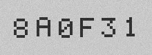
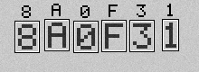
Why does ‘1’ score only 87.16? It is the narrowest glyph in the character set (just 11 px wide), with the fewest stroke pixels, so after normalization and rescaling, the noise and the 1 px jitter affect it the most in relative terms; the 94.95 of ‘F’ likewise comes from noise eroding the open ends of its strokes. The value of the score lies not in “how much was right” but in being the basis for rejection and review: the minScore parameter of Recognize draws the acceptance threshold, and a character below it does not output a guessed value but the placeholder specified by replaceChar (we pass “?”).
The engineering semantics of this parameter pair deserve special emphasis: better to output “?” and trigger manual review or a rescan than to silently emit a low-confidence guess. A misread production date that reaches the market costs far more than one rescan on the line — this is the same principle that Chapter 26 hammers on (“silent failure is the most dangerous failure”), projected onto OCR. The gap between 87.16 and 100 caused no error today, but it tells you something: ‘1’ is the character standing closest to the cliff edge in this font, and where to set minScore — and how much margin to leave — should be read out of exactly this kind of score distribution.
28.4 Confusion and Limits
The font handles \(\sigma=5\) with ease — so where is its limit? We designed a confusion stress test: the test string “0D8B” simultaneously contains two pairs of highly similar glyphs — 0 and D (both closed loops, differing only in corner roundness) and 8 and B (differing only in whether the left side pinches at the waist). The noise is stepped up from \(\sigma=10\) to 50, with 10 independent render-and-recognize trials per level.
The result is unexpectedly “steep”: the \(\sigma=10\), 20, and 30 levels are all 100% correct — at \(\sigma=30\) the image is already a blizzard of noise, yet the font stands rock solid. The first failure appears at \(\sigma=40\): per-character accuracy drops to 90%, and the failure refuses to follow the script — it is not the anticipated 0/D or 8/B swap, but D recognized as C. Figure 28.3 is the scene of that first failure: the \(\sigma=40\) noise happened to “eat away” the vertical stroke on the right side of the D, opening the closed loop — and in the classifier’s eyes it became a C opening to the right. The failure mode at \(\sigma=50\) is the same. Across the entire experiment of 50 trials there was not a single segmentation failure — segmentation is inherently more robust than classification, because it only needs “there is a blob of foreground here,” not to tell what that blob is.
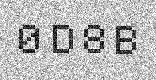
We carefully designed two pairs of “theoretically confusable” characters, 0/D and 8/B, yet the real first failure was D→C. The lesson: failure modes do not follow intuition. The confusion matrix must be measured, not deduced from human judgments of glyph similarity — what looks alike to a human, the classifier may not confuse; what looks unalike, one stroke of noise can make neighbors.
This experiment yields two actionable conclusions. First, classical OCR on a fixed-font, small character set has a large robustness margin (it saw only \(\sigma=5\) in training and withstood \(\sigma=30\)) — no need to worry about normal production-line fluctuations. Second, evaluating a font demands measured confusion analysis: crank the noise up until it fails and record the actual confusion pairs — they are often not the ones you predicted — and both the rejection threshold and the character-set design (e.g., serial-number schemes that avoid confusable characters) should be based on measured confusion, not intuition.
28.5 Segmentation: OCR’s Achilles’ Heel
Segmentation failed zero times in the confusion experiment because the character spacing was generous. Now remove that precondition: squeeze the character spacing of “8A0F31” to 0, so the strokes of adjacent characters touch directly — simulating the runaway character pitch or ink bleed common in inkjet coding. The result is in Figure 28.4: the strokes of the first 5 characters “8A0F3” merge into one large connected component about 100 px wide, and only the ‘1’ is spared because its glyph leaves empty space on its right anyway. The segmenter dutifully reports: 2 “characters” extracted. The recognition result is “?1” — that 100 px behemoth matches no glyph in the font within the 0.5–2× scale search range and is rejected by the SDK as “?”.
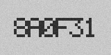
Take a moment to appreciate how this failure differs in kind from the noise failure of the previous section. Noise turning D into C is an error at the classification layer — one character is wrong, the rest proceed as usual, and the score even raises a warning. A segmentation failure is an error at the structural layer: 6 characters became 2 input units, and no downstream classifier, however strong, can undo that — its job is to answer “which character is this unit,” and “this unit is not a character at all” lies outside its question space. This is the Achilles’ heel of classical OCR: segmentation decides success or failure, and segmentation errors are unrecoverable. In the research history of document OCR, touching character segmentation was one of the most stubborn problems, and the rise of end-to-end deep learning was in large part precisely a way to bypass explicit segmentation.
The industrial countermeasure is not to conquer this problem but to keep it from happening:
- Regulate character spacing at the source: the character spacing of marking equipment is configurable; write it into the process specification and leave segmentation some margin — this is cheaper than any algorithmic remedy;
- Tie segmentation parameters to character dimensions: the width, height, and area bounds of
SegCharactersshould be set from the actual character die dimensions, so that a 100 px wide merged blob falls squarely outside the legal width range; - Alarm on touching detection: expecting 6 characters but extracting 2 is itself a strong anomaly signal — alarm and re-inspect whenever the character count disagrees, and never release a mutilated result as normal output.
28.6 SciVision Implementation
All experiments in this chapter are carried out by a single class, SCIMV::SciSvOCR, whose four-step API maps one-to-one onto the pipeline of Section 28.1:
SCIMV::SciSvOCR ocr;
SciRegion region;
// 1) Binarize to extract character foreground: manual threshold [0,125] selects dark characters
// Note: the measured semantics of polarity are the opposite of the docs -- dark characters must pass 1
ocr.GetCharRegion(img, roi, /*thresholdMode*/0, /*polarity*/1,
/*minGray*/0, /*maxGray*/125, 0, 3, 3, 0, ®ion);
SciImageArray binImgs, greyImgs; SciRegionArray regs;
SciROIArray lineRects, charRects; SciVarArray idx;
// 2) Character segmentation: 1 text line, 6 expected characters, width [8,120] height [14,56] etc. bounds filter noise
ocr.SegCharacters(region, roi, 1, 6, 10, 2, -10, 10, /*ignoreEdge*/0,
10, /*mergeMode*/1, 6, 2, 10, 0, 9999,
8, 120, 14, 56, -30, 30, 30, 9000, 0.0f, 5.0f,
&binImgs, &greyImgs, ®s, &lineRects, &charRects, &idx);
// 3) Training: feed each row's segmentation result with its labels, 4 rows = 64 samples, then train the default classifier
ocr.AddSamples(binImgs, labels); // ×4 rows
ocr.Train(0); // 0 = default classifier, input is binary crops
// 4) Recognition: below minScore, output replaceChar ("?"); scores range 0-100
SciVar replaceChar("?"), result; SciVarArray scores;
Sci2DVarArray resultAll, scoresAll;
ocr.Recognize(binImgArray, /*minScore*/0, 0.5f, 2.0f, 0.5f, 2.0f,
replaceChar, &result, &scores, &resultAll, &scoresAll);Among the key parameters, thresholdMode=0 of GetCharRegion is a manual threshold, selecting dark strokes together with the gray-level interval [0,125]; the character width/height and area bounds of SegCharacters are both a noise filter and the anti-touching defense line of Section 28.5; the Xscale/Yscale intervals of Recognize permit a 0.5–2× scale search over each character during recognition.
In practice we hit three pitfalls that must be recorded honestly:
- Under manual thresholding, the
polaritysemantics ofGetCharRegionare the opposite of the documentation. Per the docs, dark characters should pass 0, but in practice passing 0 yields the background connected component — the whole row of 16 characters becomes a single 538×78 “mega-character,” and downstream segmentation collapses entirely. Dark characters must passpolarity=1together with the gray-level interval[0,125]. SegCharacterswithignoreEdge=1spuriously raises error code 122701003, even when no character touches an edge. Pass 0 to work around it.- The automatic width bounds of
AutoSegCharacters(the automatic segmentation variant) drop narrow characters. The width interval it estimates from the samples is [19,20], while ‘1’ is actually only 11 px wide and gets filtered straight out — only 14 of the 16 characters survive. For fonts with large character-width variation, useSegCharacterswith manual parameters and give the width bounds explicitly (this chapter uses [8,120]).
The complete runnable project is at code/ocr/, with a fixed random seed; every number is reproducible.
Industry Case: The Ghost 8 in Inkjet Date Codes
A bottle-cap date-code reading system at a food plant intermittently read the “3” in the date as “8”. The investigation traced it to a slightly clogged print head: drifting ink droplets put a faint bridging stroke across the open left side of the “3”, pushing the glyph toward “8”. The key evidence was the score curve — a normal “3” scored above 95, while during the fault it dropped to 60–70, yet still above the minScore=50 set at the time, so the wrong result was released by the system as a valid read, exposed only by a customer complaint. The remediation came in three steps: raise minScore to 85; have any read below 95 trigger an automatic rescan with image retention; add print-head pressure and nozzle condition to the equipment inspection checklist, cutting off glyph drift at the source. The lesson: the confidence threshold must be derived backward from the cost of a misread, not set as leniently as possible — a threshold of 50 means the system defaults to “release even when in doubt,” and for a date printed on food and facing the consumer, that default is unacceptable.
28.7 Summary
- Industrial OCR ≠ document OCR: small character set, fixed font, hostile surfaces. Trade control of the scene for small sample counts — 4 augmented samples per class suffice to train a usable font, but only if the font is fixed and segmentation is reliable; break a precondition and the font fails.
- The classical pipeline = binarization → character segmentation → features → classification, built respectively on thresholding, connected-component analysis, and classical classifiers; it is one-way, and every step’s errors are paid for in full downstream.
- Scores are the basis for rejection and review, not decoration: “8A0F31” was all correct, yet the gap between 87.16 and 100 marked the character closest to the cliff. Derive
minScorebackward from the cost of a misread — better to output “?” than to guess silently. - Confusion must be measured: in the σ-ladder experiment the font withstood \(\sigma=30\), six times its training noise, while the first failure at \(\sigma=40\) was the unanticipated D→C (noise opened the closed loop), not the carefully designed 0/D or 8/B — failure modes do not follow intuition.
- Segmentation is OCR’s Achilles’ heel: at zero spacing, 6 characters merged into 2 input units and recognition was reduced to “?1” — unrecoverable by any classifier however good. The countermeasures live on the engineering side: regulate spacing, tie segmentation parameters to character-die dimensions, and alarm whenever the character count disagrees.
For a systematic treatment of feature design for OCR classifiers and trainable fonts, see the book by Steger et al. (Steger, Ulrich, and Wiedemann 2018). For the broader arc of OCR research, the classic survey by Mori, Suen, and Yamamoto (Mori, Suen, and Yamamoto 1992) traces the field’s history from template matching to structural analysis; for the feature-extraction stage this chapter dwells on, Trier, Jain, and Taxt provide a still-valuable survey of feature methods for segmented characters (Trier, Jain, and Taxt 1996); and to extend the scope to handwriting, the on-line and off-line recognition survey by Plamondon and Srihari is the recognized entry point (Plamondon and Srihari 2000). For 1D barcode and 2D code reading — OCR’s siblings in the “reading printed information” family — see Chapter 27.